I wanted to research into some crime drama TV shows or films and see what conventions, patterns and conventions i can pick out and see how i could apply them to my own film, i think this would be very helpful as for GCSE i done a similar thing and it really helped me. So i will be looking into three Crime/Dramas and see what they all have in common.

Prison Break
- Prison
- Use of drugs or forensic teams
- Drug abuse
- Dramatic something always happening
- Dramatic music when something is about to happen or has happened
- Good use and white use of
camera shots to show clues, or
Ways for the prisoners to escape
- Really effective use of close
ups to show danger emotions and
Expressions
- Some form of corruption

CSI: Crime Scene Investigation
- Always starts with a crime scene
- Drug use in the show ( effects of people using drugs)
- Close ups to show clues about a crime scene
- Strange lighting used in flashbacks to signify a flashback
- A lot of the times there is a twist
- Never enough evidence, so makes things hard to figure out
- Fast paced music when something has happened

Scarface
- Dark lighting in the film
- Heavy drug use
- Very strong language
- Corruption
- A lot of murder
- Sexual scenes and references throughout
- Antagonists are foreign
- Scarface theme tune plays during significant events, very suspenseful dark sounding low music.
Looking at these films and TV shows i have found a few interesting patterns, firstly there is a consistent use of drugs in each of them, secondly there is a large use of dark lighting, this is because crimes are usually bad things and associated with bad and dark so the use of dark lighting will build on to it and also showing what is happening or has happened is bad.
The one i am particularly interested in is CSI, this is because it opens up with a crime scene so it tells the audience what was happened, but now it is their duty to find out why, so it gets them thinking whereas the other two don't do that, but that is something i want to achieve, also the use of flashbacks i found very affective as it could show a lot about a character or a crime that has taken place, i will be using influences from CSI as it appealed to me more and linked to what i want to accomplish.
 Goodfellas is about an New York based Italian mafia where a little boy works his way up the ranks. In this film opening we began to look at how camera shots show who is the protagonist, what is happening, how they can show someones emotions, at first we was confused like how is a camera shot going to show so much? We looked at a master shot of the protagonist driving the car and three people in the back, he was the main focus of the scene so it was obvious he was the centre of everything, and then we began to look at the dark lighting and how it creates and successfully achieves a dark atmosphere the film opening for this was at first subtle, dark and slow which was very affective, whereas the other film "city of god" was fast paced yet effective.
City of God is the second film we looked at, it was very fast paced with a variety of different shots and camera angles such as close ups, panning, tracking etc, it is all really fast paces but it works as the event in the opening is very fast paced, this lesson was actually very useful as it showed what we would need to do to make it affective and what pace creates what sort of effect, for example slow and dark makes it suspenseful and fast being like adrenaline action.
 Analysis of thriller poster
'Shutter island"
- Dark lighting (sinister and suspenseful)
- Blue glow around the island showing significance
- The fire showing his face shows darkness surrounding him
- Serious look on the protagonists face
- Shows the protagonist on the front cover
- Protagonist facial expression also shows fear
- Name of protagonist under his face
- The Font is very sharp and cold giving it an eerie feel to the film, contrasting with the red subheading showing that its evil as red is often a symbol of blood and evil.
- The capital letters give it a cold feel

The others
- Very simplistic yet effective colours, darkness vs light giving an insight to the film.
- Majority of the poster is dark could show darkness has taken over good (which is represented by light)
- Female protagonist, who looks scared and alone as she is the only one there, the dark lighting over her face could show she is loosing the battle between good and evil.
- Very simple picture but gives
off a scary eerie feeling.
- Early 20th century lighting and
costume used to show when its
based
Font analysis
- Use of capitals
- White writing over the black
black ground showing contrast.
- sinister font, as its sharp and
cold
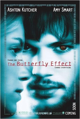
The Butterfly Effect
- Face of Male protagonist on the front cover,looks very serious and stern with an image in his left eye possibly giving a visual insight into the film
- Face of damsel in distress on the front looks lost
- Blue sepia lighting gives strange uneasy look to the film making it seem surreal and unrealistic
- Abstract look and feel to the picture as it isn't very clear to what is going on.
Font analysis
- The title of the film in a 1980's type computer writing could show when it is based.
- The red colour of the title breaks the blue sepia colour, but contrasts with it to give it a eerie feel
- Placement of the title is in the middle so the audience can directly look at it.
- Credits are around the photo framing the faces of
the two main characters
Within the three film posters, there is something i have picked out which stood out the most and that is the use of lighting, the first two used dark lighting which i thought was very effective as it created a feeling of suspense and made it look very eerie, also the use of blue lighting was present in two of the film posters this made it very abstract however was very effective. In all of the posters the characters either looked confused, scared or worried which links into the film as it shows the emotions and the tone of the film throughout. Also the fonts used a lot of red as red is very much linked with thrillers as it gives a cold feeling to it. Also the use of white was very effective as it contrasted with black making things stand out more and also showing a battle of good vs evil within the film as it is present in a lot of thrillers.
We had to create a survey to see what appeals to the audience. We had put in place ten questions asking things which could help us dictate how our film should look, for example things such as age and gender to see how and what appeals to different genders and age group and all their preferences. Also we wanted to see what people look for in a film opening, this is good for us because we can use this to our advantage to create a effective film opening, with the information extracted from the questionnaires we then designed a bar chart showing the results, and from these results we analysed the information given.
In this bar chart i evaluated two of the questions, one about what elements of mise-en-scene work the most effectively, the second question was about what type of film (fiction or non fiction) generate the most amount of money, this question was interesting as it showed peoples preferences. The information i got from this was interesting as it made me realise the importance of sound track and lighting, which means that i will need to put much more focus on this as i would've done previously as i thought it was mainly the custom and setting which had more of an affect. I learnt that i need to put a much heavier focus on lighting and sound as it is very affective and the people who i surveyed made it clear that it needs to be a main priority.
No comments:
Post a Comment